Lessons Learned From Commercial Design
Oct 08, 2019 | Carpet One Floor & Home
In this age of constant digital communication, what was once a separate life at the office has now freely and frequently become part of our home life. Our offices are essentially everywhere. When I think of the ways my commercial clients use their workspaces, I am reminded of the ways my residential clients use their homes. Making these workspaces comfortable, usable, and durable is what we do for our residential clients, especially families. From my work on commercial projects, I have distilled my experiences down to these Five Rules for Success.
1. Develop A Clear Narrative
My practice provides services for both residential and commercial clients, and although these clients are quite different, the basic activities remain the same. One of our first tasks is to develop the program for the space. During this phase, we characterize the space with a narrative. The narrative contains the guidelines for the project. This means we determine the needs of our client; we establish their aesthetic preferences, if any (most people have at least a Pinterest board, or I encourage them to start one!); and then we align those with the architecture and begin to outline what we can provide decoratively to best suit the narrative. This is most often five to six adjectives that can describe how you feel in a space, what the space evokes, and how it functions.
2. Durability Is A Must
Commercial spaces get a lot of wear and tear. People eat at their desks and spill drinks on the upholstery. Sound familiar? For these reasons, I am a huge proponent of performance upholstery. There is an increasing demand for upholstered pieces in family living rooms as well as in company waiting rooms. Sometimes performance fabrics can cost more, but their longevity makes them worth the investment. Soft goods that are designed for commercial use are absolutely okay to use in a residence—just make sure you feel them first! Installing items that will last is sustainable both for the environment and for our wallets.
3. Mixing Styles Adds Interest
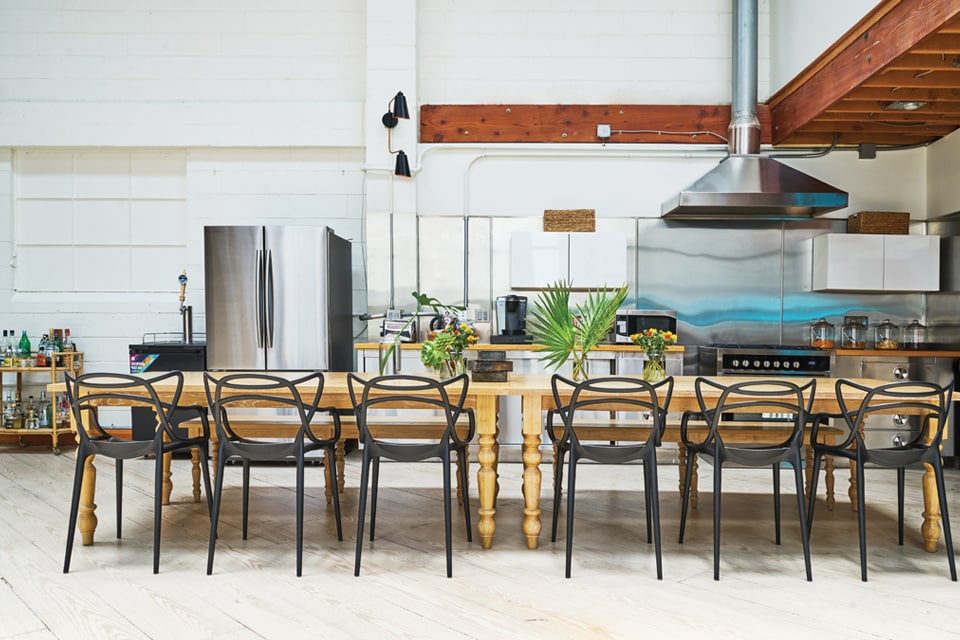
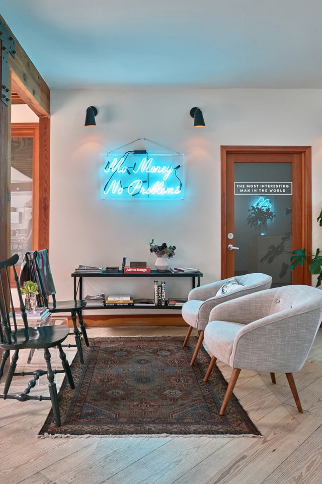
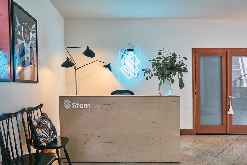
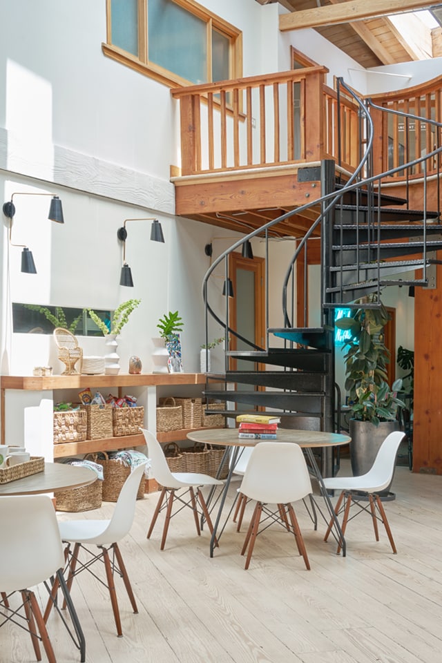
Even on a restricted budget, I shop high and low for furniture, lighting, and accessories. For this office, we purchased vintage items while staying on budget. We have some vintage area rugs and industrial carts from Chairish. We also have some incredible vintage Windsor chairs that are lacquered and add interest at the entry. Our sconces and pendants were sourced new and affordably. We mixed these with some farmhouse dining tables and Masters chairs in the company dining area. The contrasting styles, textures, and colors all add a layer of interest that develops the overall design and generates a unique and beautiful space.
4. Encourage Personality
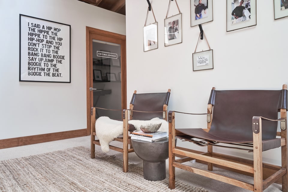
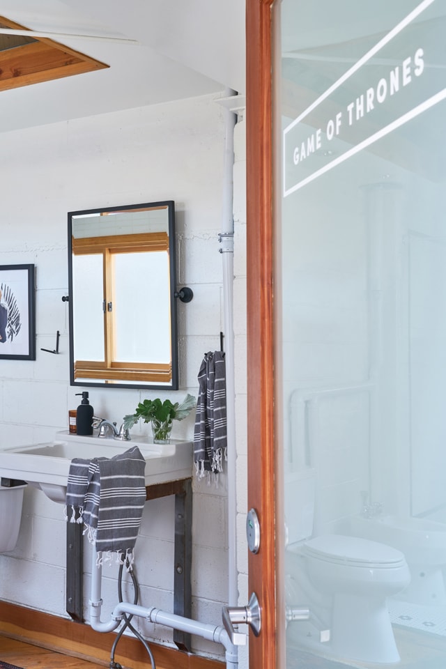
Within the framework of the design narrative, I work with my clients to determine how we can showcase their unique perspective. In this office, all of the large-scale photography depicts musician clients. These pieces add color and emotion to what are often monochromatic spaces. I have also encouraged the staff to name each room. “Conference room” was too generic, for example. The rooms needed personality. The staff members’ response was absolutely unique—and I nearly vetoed it. They decided to name each room based on a meme or a pop culture reference. The upper bath is now “Game of Thrones” and the main conference room is “Success Kid.” To help bring this to fruition, we added the room name to the glass on the door and also had an illustration of each of these room names commissioned. These illustrations are about twelve inches square and are framed in each room.
Encouraging the clients to name the rooms gave them permission to infuse the spaces with their personalities. I think residential clients can be best served in the same way. Of course designers want to create spaces that are gorgeous in a photograph, but we absolutely need to allow our clients to personalize their homes. I often find, especially with clients hiring a designer for the first time, that people are cautious about using or inhabiting their spaces. They often need a designer’s permission and/or guidance to determine how best to personalize a space.
5. Designate Spaces With Clarity Of Function
This office employs about eighty people and continues to grow. The main area is open, with incredible amounts of natural light, but planning that space meant spending a lot of time programming and drawing furniture plans to allow for the necessary volume of standing desks and chairs as well as the other furnishings. We then needed to provide storage for personal items. We purchased some old school lockers where the staff could store their bags and other small items. In a residence, this is your entryway or mudroom storage. Because this office is a startup, many of the staff work odd hours. Some bike to work or stay into the wee hours of the morning programming. In the upper bathroom, we provided hooks for towels and baskets for personal items. These additions are labeled and organized without seeming cluttered. In the small break-out area, we designated a snack wall. I provided a range of woven baskets where employees could store all manner of snacks for easy access and tidy presentation.
What I’ve learned from working on commercial projects is applicable to my residential projects as well. Successfully designed spaces, be they commercial or residential, reflect the people who inhabit them. As designers, it is our job to get to know our clients, to understand them, to outline their ideals, at times to challenge those ideals, and to visualize what elements set them apart from others. By doing so, the spaces remain authentic and become workable (nay, livable) while also being beautiful.
Annie Fair is an interior designer based in Charlotte, North Carolina. As a North Carolina native, a former Los Angeles resident of 17 years, and graduate of the NYC-based Parsons School of Design, Fair maintains a growing number of projects on both the East and West coasts. Before starting her own namesake firm in 2017, the talented designer honed her skillset under the wings of Kelly Wearstler, Michael Smith, and House of Honey.@AnnieFairDesign